Ivars - Rebrand Project
This Project was centered on bringing new life into an older company who might need a modern "refresh". Ivar's is a company I have known and grown up with for many years here in the Seattle area. Recreating this companies stationary and logo presence was an exciting and fun project.

The final form of the newly designed logo. In a simple black and white format. Attempting to stay akin to Ivar's original styles, the clam and the company motto was to make the main stage in this iteration.
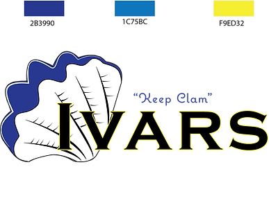
Adding color to the logo, I chose to take inspiration from classic 'Seattle' colors, of blues and yellows. Here is the color variation of the Ivars logo, with color codes. The predominant colors are blues, with yellow as an accent.

The final mock-up of the re-brand. incorperating the logo work and new identity into the stationary of the company was quite fun. The aim was for a bit higher end feel, but bringing in its relaxed feel and motto "keep clam" using elements of the sea and beaches.

A secondary color variation for darker backgrounds. Keeping the same color options and main/accent style as before, but making the focus colors in a different order, too also keep its visibility.
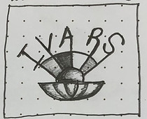
Below are the intial sketches I had landed on before starting to render them digitally in Illustrator. Aspects from all three were considered in the final design, however the middle one was the base.